
Hannover 96 (All Three) - If this list wasn't in any particular order, Hannover 96 might just sit atop our list of worst jerseys. Under Armour has managed a rare treble by skunking up all three uniforms with a ghastly mix of design elements. Under Armour's questionable design surprised me since they have managed to come up with some decent college football uniforms (Utah, Texas Tech), aside from the piping, but the wedges/slashes at the collar just don't work well on the pitch. Under Armour nearly landed two entries on the top ten (Omiya Ardija), but they are still second fiddle to Adidas... click clack? Maybe next year.
VfL Bochum (Home & Away) - Our first entry by Do You Football is probably their worst. I can't help think the home jersey was the result of laying down on a freshly painted white park bench. These are also frustrating because their 2008 kits were pretty decent.
 Schalke 04 (Away Black) - This jersey leaves us shaking our heads, and I'd like to think the people of Gelsenkirchen are shaking theirs as well. Schalke 04 suffers from Adidas' 2009 assault on our eyes, and from what I can only call a collar explosion, which is sadly not unique to Schalke 04.
 Chelsea (Home Blue) - As was pointed out on this site in an earlier post, one word describes what's wrong with this kit: zipper. Let us, for a moment, set aside the odd external stitching look and the questionable placement of seams. What is the deal with the zipper? We've watched a number of Chelsea and Bayern Munich games, and have yet to see a player pull the zipper down. Is it functional? Is it for show? And, if so, who thought it was a good idea?
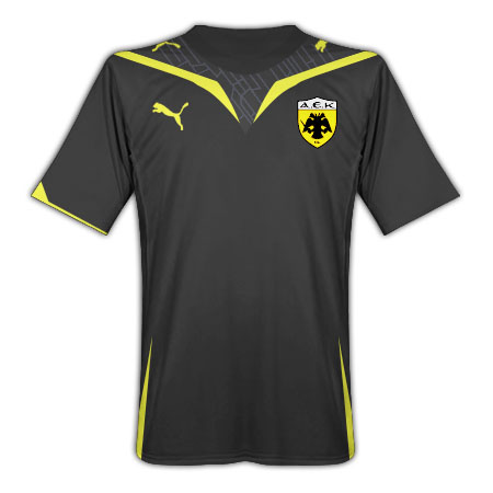
 Puma Template - We came across a number of particularly foul jerseys, and - what do you know? - they were all based on the same Puma template. The proliferation of Puma logos has annoyed us, but the pattern around the neck and the accents are just too much to handle. You might be thinking "Well, it's not so bad." Well, take a look at what happened to Bordeaux Girondin's kits. Do they come with sailor hats? Also falling prey to Puma are AEK Athens, Lazio, and Brugge.
Bayern München (Home Red) - This is basically a red version of Chelsea's home blue, but they lose points for the wretched continuation of the team-name-above-the-numbers-player-name-below trend. The only thing worse than this is having a sponsor above or below the numbers. Bayern München's home kit saddens the Optimator, since their away and third have real collars and don't look so bad. Maybe they need "Bayern München" on the back so you don't confuse them with Chelsea. The Bundesliga is dominating this list, and this is a perfect example of why.
 Olympique Marseille (Away Blue) - This is a particularly odd jersey for our list because their home whites look pretty good. After I recovered from the seizure caused by this jersey, I noticed it looks like they didn't have enough material to complete it, so they used bits and pieces of left over fabric from other jerseys. There is just way too much going on here. Just try not to stare directly at it.
 Palermo (Away Black) - Did they find this at Juicy Couture?
Olympique Lyon (Black-Red) - This is very similar to the Marseille away jersey, in the sense that the Lyon home white nearly made our ten best list. There isn't much to say about this, aside from the fact that it's hideous. There is a good reason the gradient look is not used...ever. For those of you keeping count: Ligue 1 - (4); Bundesliga - (4). Our last jersey will decide the winner!
Kaiserslautern (All Three) - And... the Bundesliga takes the title over Ligue 1, thanks to these particularly unctious entries by Do You Football.
Also Receiving Votes :
Omiya Ardija - Under Armour takes its assualt to the J-League with these Hannover 96'esque designs. How do you say "There is no god" in Japanese?
Adidas (All Designs) - This is a banner year for bad design at Adidas. Perhaps the pressure to create something new has forced their hand into farting out some bad ideas. The classic shoulder stripes that stop short, and in some cases are terminated by bizarre piping that makes them look like Napoleon, are just a horrible move. Add in Liverpool's black third kit and I'm practically sick to my stomach. Lets just go back to the trefoil and pretend the last few years never happened.
No comments:
Post a Comment